Identity
Campaign
Strategy
This concept rebrand for Oregon Ballet forces old world to meet the new, as it disconnects from old connotations of “ballet” and refocuses its energy toward more organic movement and storytelling for a new generation. This project takes an environmental design approach, and is rich in contemporary design and intellectual content, attracting new viewers — lovers of art and culture who might not have previously considered dance.

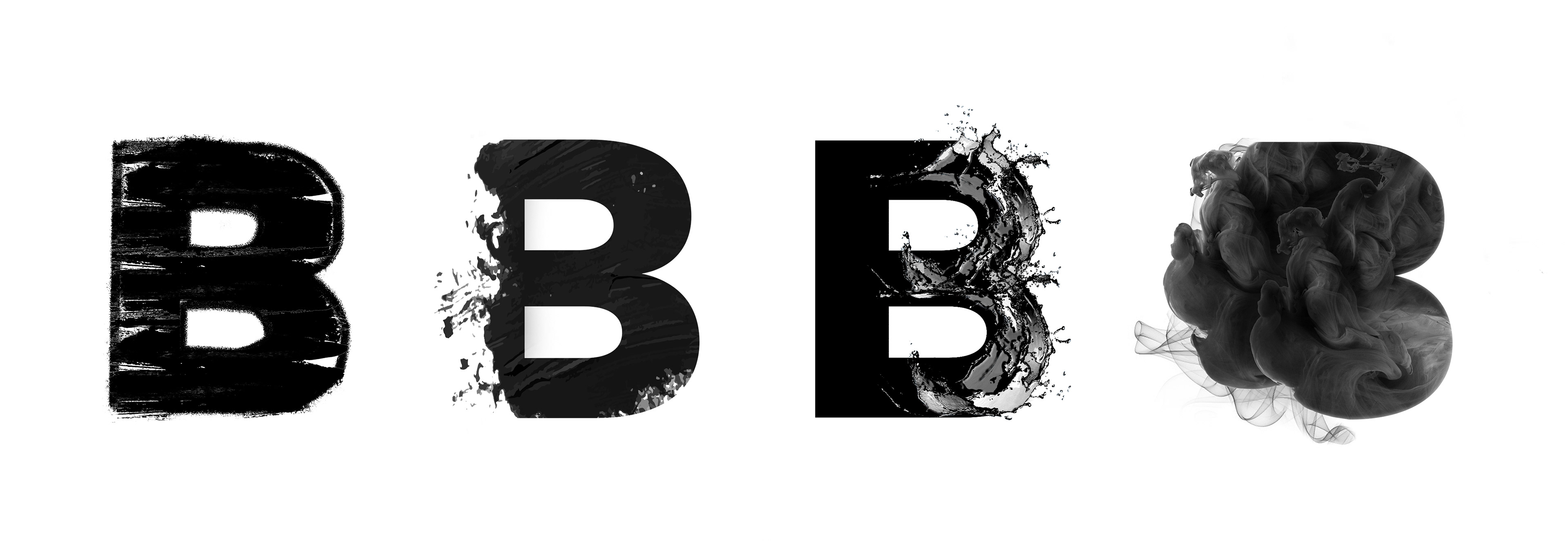
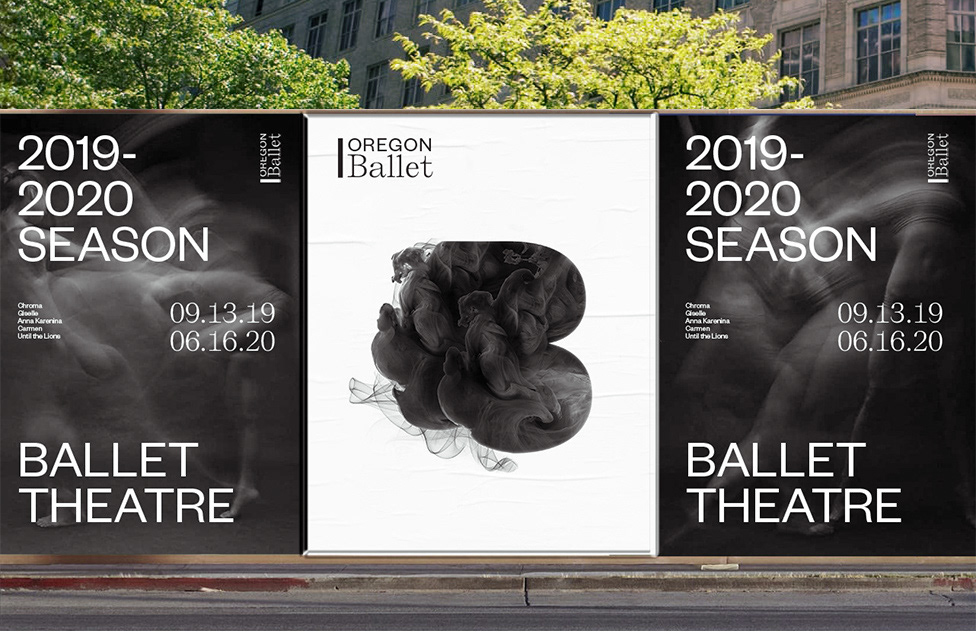
The B as a Framing System
Movement + Storytelling
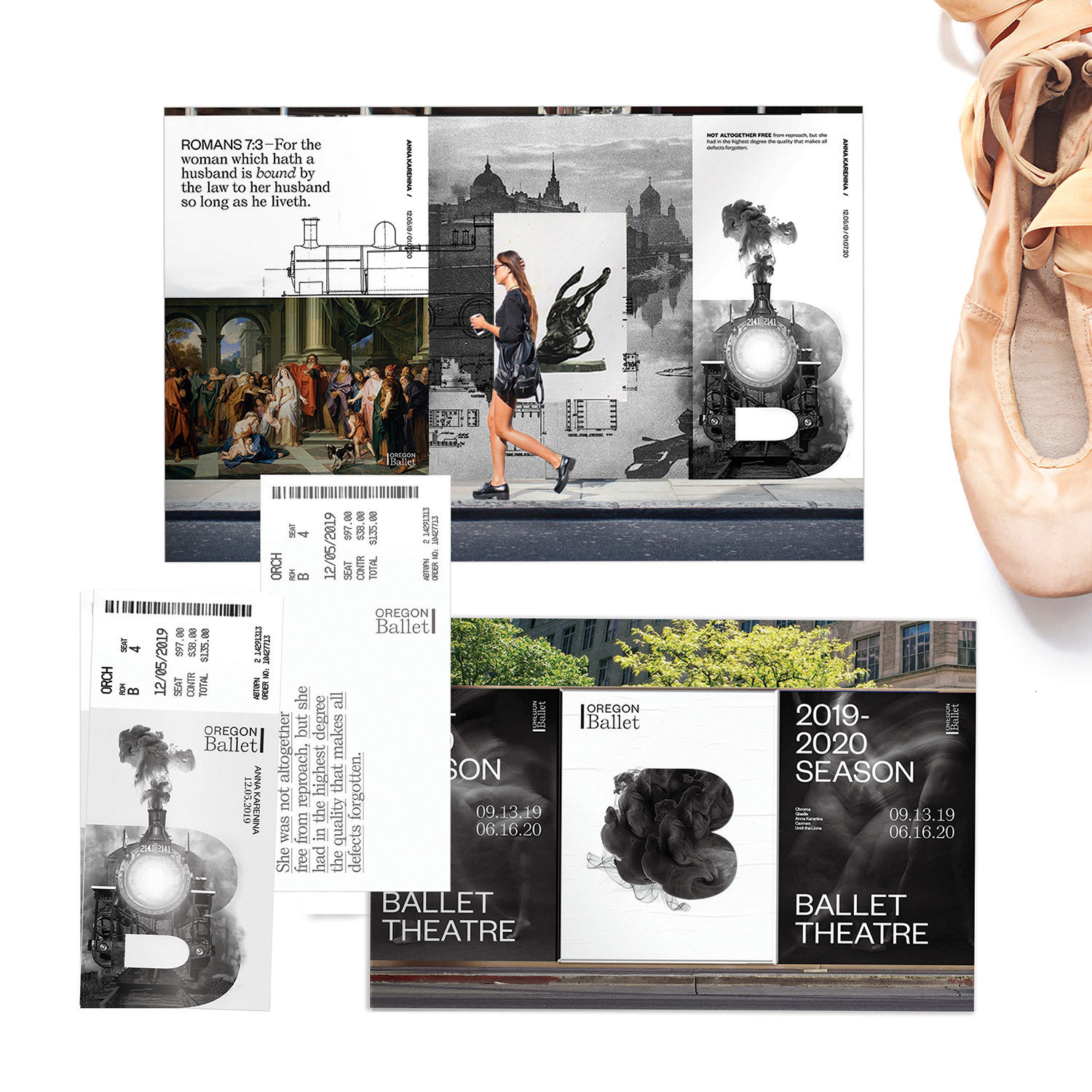
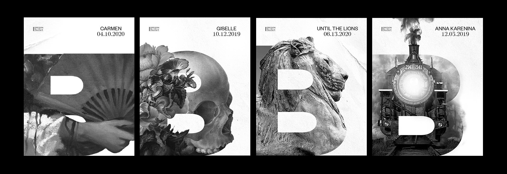
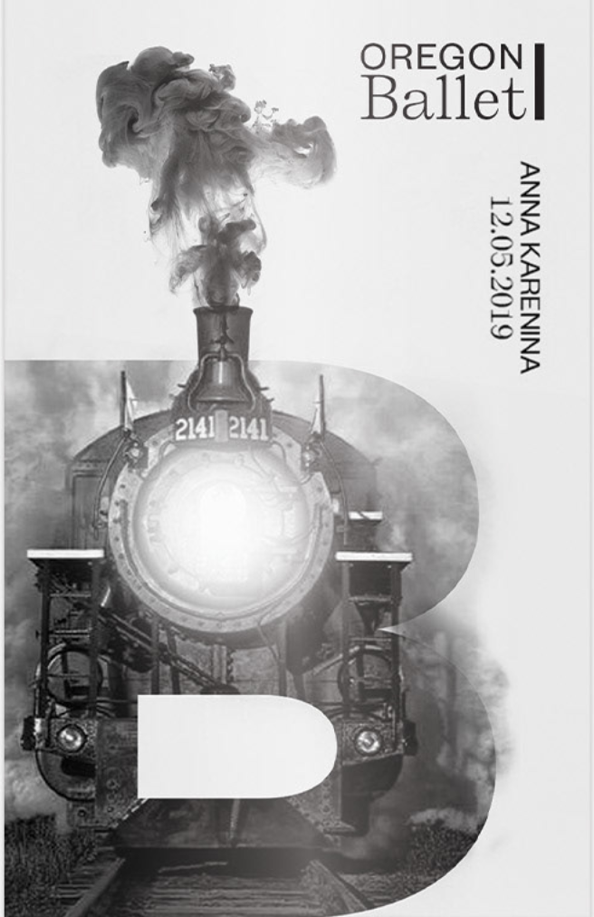
The B for "Ballet" is utilized as a frame in two separate systems. The first system communicates movement through artful forms such as the aggressive jostling of charcoal or the energetic splash of liquid. The second system uses the B to frame storytelling elements from a given show in a season.
Bringing the Intrigue Outside
By taking the ballet to the streets of Portland in an intriguing way, the campaign seeks the attention of a younger audience. This younger audience is currently disconnected from ballet as a culture, and would not otherwise seek ballet theatre out on their own time, such as by surfing the web or scrolling through Instagram. By bringing beautiful design that teases storytelling, rather than overt photography of stiff performances, this campaign begs the viewer to come meet it in the middle.
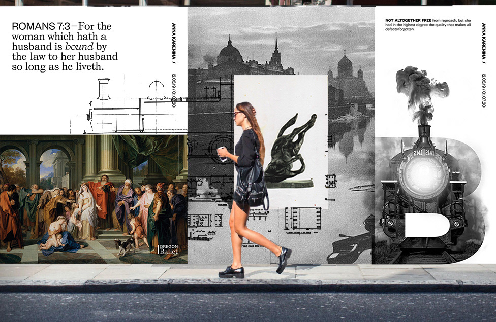
Subtle & Intriguing Narrative
Playing to intellectualism
When connecting would-be audience members to an upcoming show, the campaign utilizes new and existing imagery pulled from classical art, culture, literature, etc. and placed in a way that subtly strings together a narrative. Visually, this style feels like a moodboard, or a Tumblr collection, appealing to the millennial intellectual.
Anna Karenina imagery


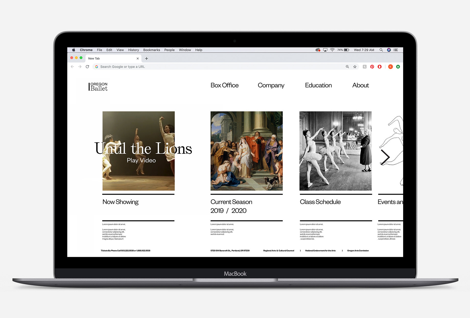
Clean Deliverables for a Wide Audience
Web design + take-aways
While this Oregon Ballet campaign plays up conceptual thing and design, the website and take-aways remain clean, efficient and straightforward. The design-centric campaign got the viewer to the site, now the site needs to remain user friendly so that 1. new audience members can easily find information, and 2. existing audience members will not become frustrated.